The Milwaukee Neighborhood News Service tells stories that may not receive attention from big media outlets.
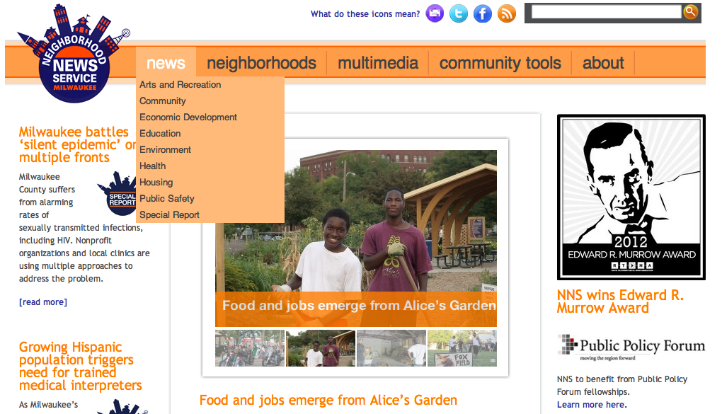
On Wednesday, our JOUR 1550 class had the privilege to meet with Sharon McGowan, the editor-in-chief of the Milwaukee Neighborhood News Service. MNNS is an online news website that reports on events, organizations and issues within Milwaukee communities, often focusing on areas that don't get thorough news coverage from major news outlets. McGowan started MNNS in March 2011, and the website now covers 15 Milwaukee neighborhoods. I'd heard of MNNS before, since they are partnered with the Diederich College of Communication and their headquarters are located on the fifth floor of Johnston Hall. However, I'd never considered the important role they play in giving a voice to Milwaukee's underrepresented communities. McGowan said that many of the neighborhoods MNNS covers will only end up in the news because of a crime, and that one crime might lead to five or six stories. To give us an example of the types of stories her reporters tell, McGowan showed us a video, produced by Andrea Waxman, about a group of young moms who have come together to help others in their community: McGowan said that the "ultimate goal" of MNNS "is to improve the quality of life in the communities [they] cover." We'll be writing our own stories for the website later on this semester, breaking off into groups of two to profile community organizations in the neighborhoods MNNS covers. I can't wait to find out what our assignments will be; I think everyone can benefit from these projects, since we'll get some experience doing journalism in Milwaukee, rather than confining ourselves to news on campus and downtown, and local organizations will have the opportunity to share their stories.
 The last time The Miami Herald posted an audio slideshow was in the aftermath of the 2010 Haiti earthquake. When we were first given our beats for JOUR 1550, one of the things that struck me about The Miami Herald was its section dedicated to multimedia. The videos and photos don't come as any surprise; it would seem that most newspapers are delving into these aspects of online journalism. The multimedia section also contains links to podcasts from WLRN, Miami Herald's public radio station. What I'd like to focus on, though, is the Herald's use of audio slideshows. We're working on our own audio slideshows for our One @ Marquette projects, so I was curious to see what my beat had to offer in that respect. The New York Times' One in 8 Million series has certainly set a high standard, and I regret to report that The Miami Herald doesn't have anything quite so impressive. The most recent audio slideshows are pieces from two of the newspaper's photographers, describing what it was like to cover the aftermath of the earthquake in Haiti. The photographs are moving, often overwhelming in their emotion; unfortunately, I was distracted by the use of vertical photos and different dimensions, which emphasized to me the importance of being consistent in my photography so as not to detract from the emotion of the photos. The Miami Herald's audio slideshows are often more informative in nature, rather than telling any personal stories. For that reason, I found many of them to be a little boring. However, there is one slideshow that particularly impressed me, "After Guantanamo," because the reporter used a lot of natural sound, which gave the piece a very strong sense of place, and it's clear that the photographer must have had to work hard to take meaningful shots, since censors at Guantanamo decide which photos are okay to use and which are not. Overall, The Miami Herald has an impressive selection of multimedia, including audio slideshows. However, it seems they haven't posted one in a while, and some are better than others. The website seems to concentrate its efforts more on photo galleries, videos and podcasts.
When I heard our next beat assignment for #loweclass was to blog about our website's coverage of NFL opening weekend, I groaned--loudly. Of all the things that interest me, football doesn't even make it onto the list. And despite having lived in two sports-obsessed cities, Chicago and Milwaukee, I know very little about sports journalism. With this in mind, observing The Miami Herald's coverage of the Dolphins this weekend was as easy for me as understanding a game of cricket. Even though I felt a little out of my league with this assignment, it was still interesting to see how The Miami Herald chose to report on their city's football team. First, I did a little research and learned that although the Dolphins are relatively new to the NFL, they've won two Super Bowls and completed the only perfect season in NFL history. That sounded like a legacy worthy of some pride. So I was surprised when, on Saturday, the sports page's top story wasn't about the Dolphins' upcoming game against Houston on Sunday; instead, the headline lamented the Miami Hurricanes' defeat against Kansas State. The Dolphins were relegated to the headline below that, a rather opinionated article about the Dolphins' need for "pass-rushers." This gave me the impression that Miamians might be more interested in college football than they are in their NFL team. Again, I don't know much about sports journalism, but the day before a big game I would want to read articles about team dynamics, game strategy and how players match up against their rivals. On Sunday, the Dolphins' game against the Houston Texans was front and center on both the sports and home pages. There was a scorecard below the header, and the top story linked to a live blog of the game written by Armando Salguero. Such tools are helpful for casual and devoted fans alike, especially when some people might not be able to watch the game live; I think it's great that the Herald made them so accessible. However, I did notice a few commenters criticizing Salguero for his spelling and grammatical mistakes, most of which seem to have been fixed before I read the blog. It looks like The Miami Herald might have a few things to work on in terms of professionalism on their reporters' blogs; I'll put the lack of NFL enthusiasm down to the Dolphins not appearing in a Super Bowl since 1985. But I am impressed by the site's user-friendly approach to reporting the highlights of live games and offering post-game reflections. Still, you won't catch me reading any football articles this season.
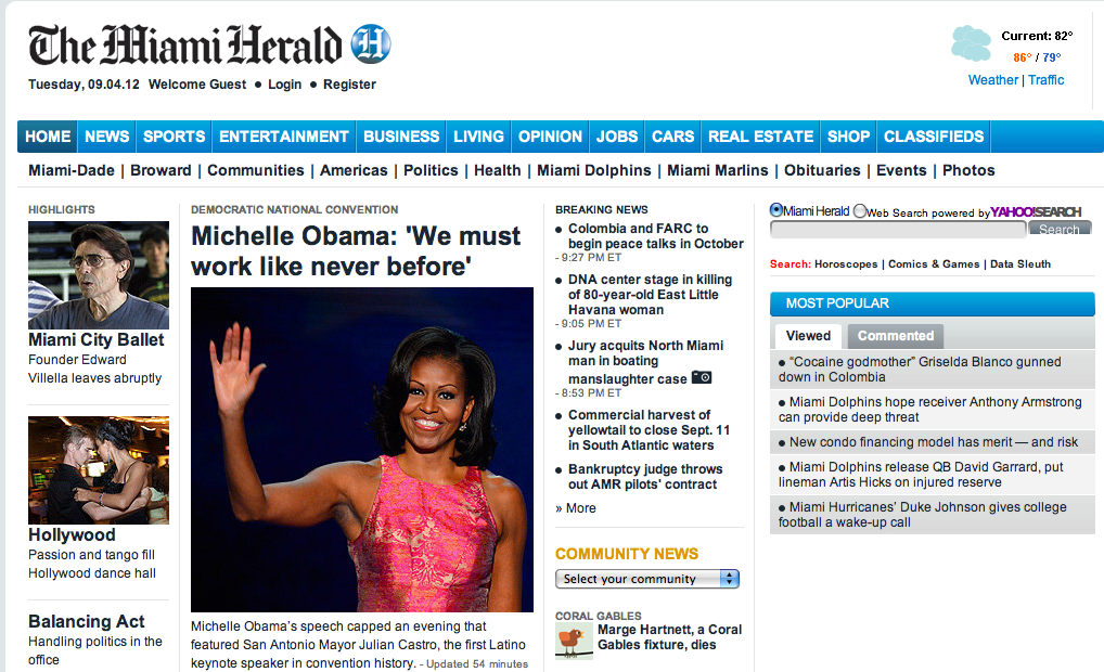 It's hard to tell text apart from hyperlinks on the Miami Herald home page. Okay, I'll admit it: Most of my news comes from Twitter. True, the tweets link to news websites, but in general I have found news sites to be too cluttered and difficult to navigate for my tastes. Some exceptions include the Milwaukee Journal Sentinel and TIME. In my opinion, when it comes to website design, simple and clean is best, with a strict adherence to the rule of thirds. Until Professor Herb Lowe assigned us our digital beats for this semester, I had never once been to The Miami Herald's website. Upon my first cursory glance of the front page, I felt a little overwhelmed. There is a lot of text, which appears to be the same color as the links. This is problematic because visitors should easily be able to tell what is text and what is hyperlink. Instead of a simple three-column layout, the designers went with a cramped four columns. The left side of the page is graphic-heavy, while the right side consists of text and links. Those columns end about a third of the way down the page to make room for another series of sections, positioned horizontally. Here, the visitor can find multimedia, a news "grid," community news, opinions, and a marketplace. These five sections can be moved up or down if the visitor wants to modify their view of the front page, which is rather new to me; I don't think many news sites allow visitors to do that. At the top of the page, there is the typical navigation bar to aid movement through the different beats like news, sports, and entertainment. There is even a sub-navigation bar to help visitors narrow down their search, though it would be more helpful if the sub-navigation appeared when the cursor hovers over the top navigation, like JSOnline and The Chicago Tribune. The "Community News" drop-down menu also makes it easy for visitors to find the news that is relevant to their location. Many of the top stories have photographs, slideshows, videos, or some combination of the three. The story about Michelle Obama's speech at the Democratic National Convention, for example, has a sidebar with a slideshow and two videos, squeezing the text into a rather small column. Regardless, the slideshows add a nice touch of interactivity and multimedia to the site. I also like that the writers mention Mayor Julian Castro, the first Latino keynote speaker in DNC history, and emphasize the convention's diversity. Miami has a very high Latino population, so it's clear that the Herald is keeping that audience in mind. Each article has a discussion section, where visitors can choose to connect with their social media accounts and leave comments. All articles have buttons to share via Facebook, Twitter, and Google+, which is no surprise in this day and age. The multimedia section is actually rather impressive, boasting a collection of videos, photos, audio slideshows, and podcasts. If I lived in Miami, I probably wouldn't visit the Herald's website on a daily basis, simply because it is such a pain to navigate. However, I can appreciate the newspaper's endeavors to use multimedia in a creative way and give national stories a local spin.
|
 RSS Feed