It's hard to tell text apart from hyperlinks on the Miami Herald home page.
Okay, I'll admit it: Most of my news comes from Twitter. True, the tweets link to news websites, but in general I have found news sites to be too cluttered and difficult to navigate for my tastes. Some exceptions include the Milwaukee Journal Sentinel and TIME. In my opinion, when it comes to website design, simple and clean is best, with a strict adherence to the rule of thirds.
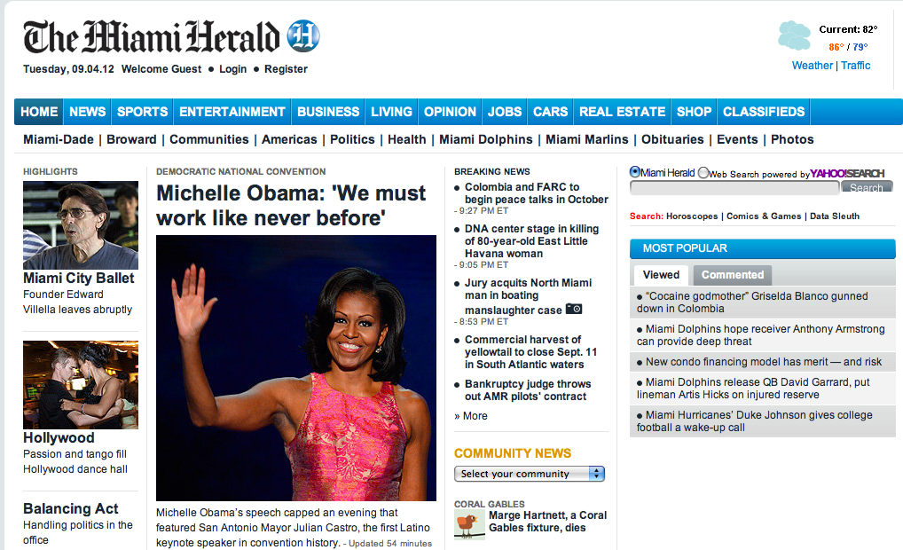
Until Professor Herb Lowe assigned us our digital beats for this semester, I had never once been to The Miami Herald's website. Upon my first cursory glance of the front page, I felt a little overwhelmed. There is a lot of text, which appears to be the same color as the links. This is problematic because visitors should easily be able to tell what is text and what is hyperlink.
Instead of a simple three-column layout, the designers went with a cramped four columns. The left side of the page is graphic-heavy, while the right side consists of text and links. Those columns end about a third of the way down the page to make room for another series of sections, positioned horizontally. Here, the visitor can find multimedia, a news "grid," community news, opinions, and a marketplace. These five sections can be moved up or down if the visitor wants to modify their view of the front page, which is rather new to me; I don't think many news sites allow visitors to do that.
At the top of the page, there is the typical navigation bar to aid movement through the different beats like news, sports, and entertainment. There is even a sub-navigation bar to help visitors narrow down their search, though it would be more helpful if the sub-navigation appeared when the cursor hovers over the top navigation, like JSOnline and The Chicago Tribune. The "Community News" drop-down menu also makes it easy for visitors to find the news that is relevant to their location.
Many of the top stories have photographs, slideshows, videos, or some combination of the three. The story about Michelle Obama's speech at the Democratic National Convention, for example, has a sidebar with a slideshow and two videos, squeezing the text into a rather small column. Regardless, the slideshows add a nice touch of interactivity and multimedia to the site. I also like that the writers mention Mayor Julian Castro, the first Latino keynote speaker in DNC history, and emphasize the convention's diversity. Miami has a very high Latino population, so it's clear that the Herald is keeping that audience in mind.
Each article has a discussion section, where visitors can choose to connect with their social media accounts and leave comments. All articles have buttons to share via Facebook, Twitter, and Google+, which is no surprise in this day and age. The multimedia section is actually rather impressive, boasting a collection of videos, photos, audio slideshows, and podcasts.
If I lived in Miami, I probably wouldn't visit the Herald's website on a daily basis, simply because it is such a pain to navigate. However, I can appreciate the newspaper's endeavors to use multimedia in a creative way and give national stories a local spin.
 RSS Feed